PocketLib 1.6: Design refresh
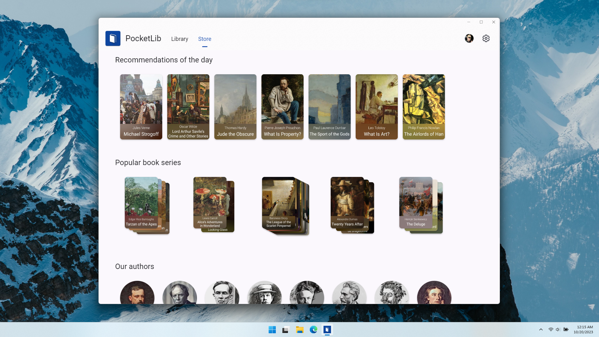
Today we release the biggest visual update for PocketLib with a completely redesigned interface.
Design
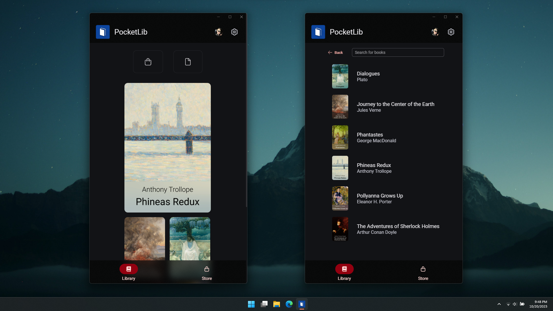
We modernized the entire UI of the app. Compared to the old version, the app now looks much cleaner and more mature.
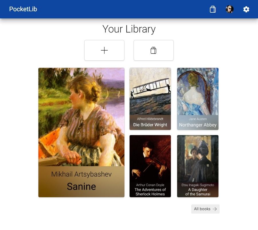
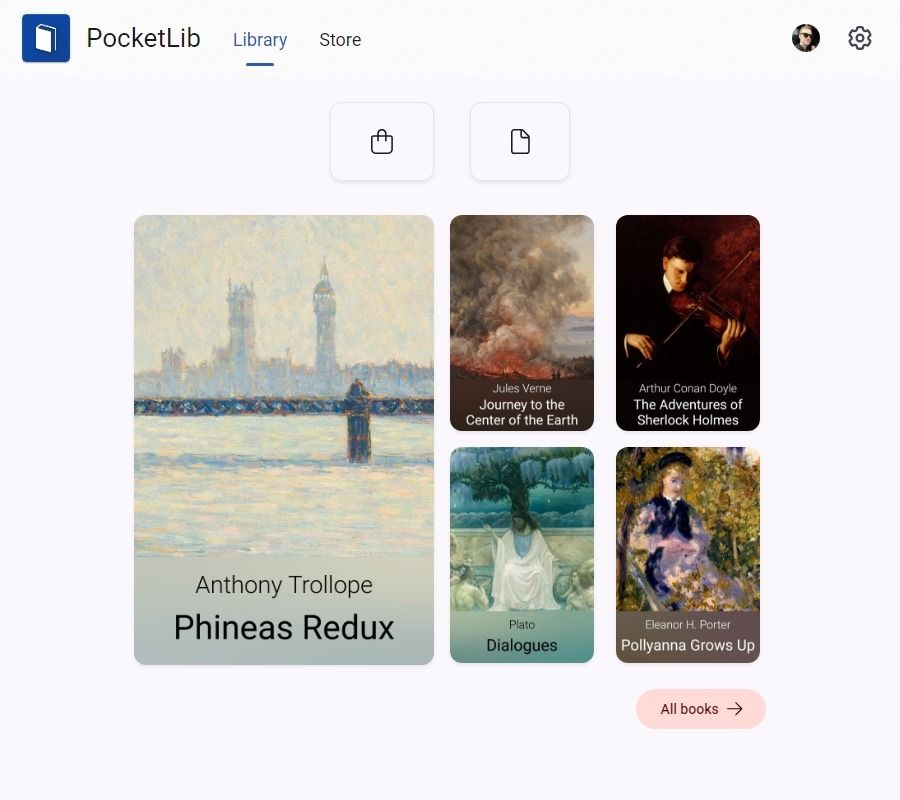
PocketLib v1.5 (left) compared to v1.6 (right)
We rebuilt all the small parts that make up the app, everything from icons and buttons to the navigation.


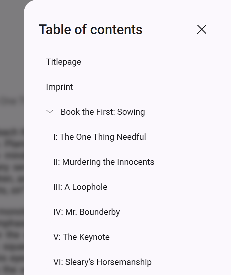
A few of the new elements in v1.6
Library page
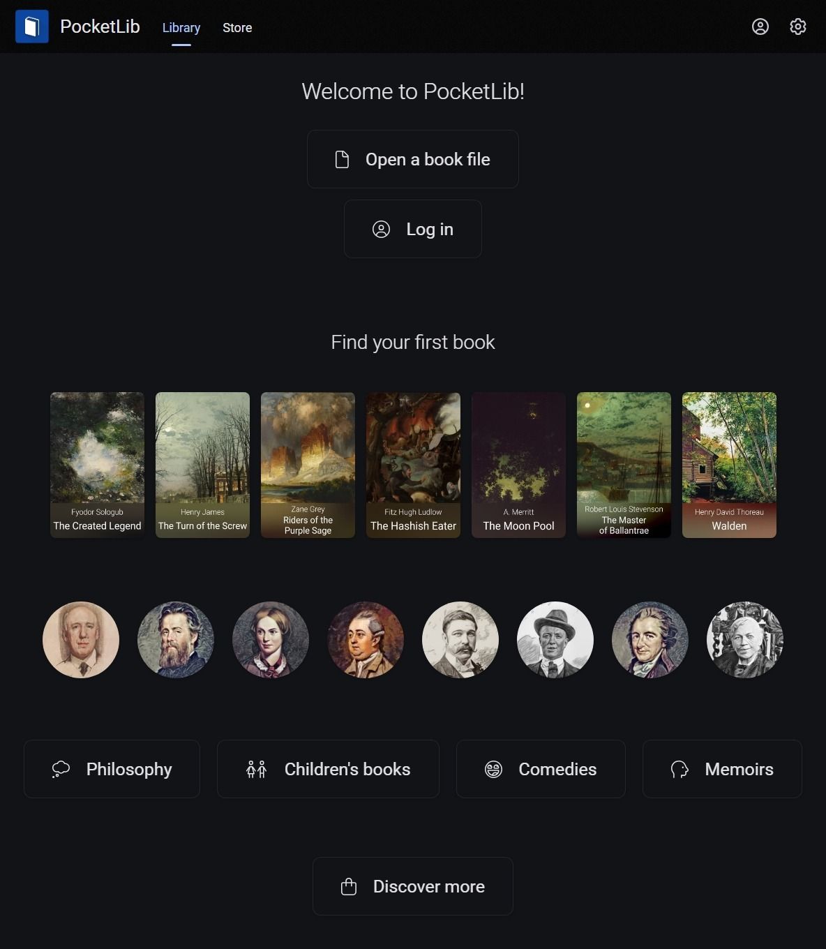
This is the new library page. You will notice that the layout is mostly similar to the old version, but now featuring our new design language.
If you open PocketLib for the first time, you will be greeted by a new welcome message, with quick actions and recommendations to find some interesting books.
Book reader
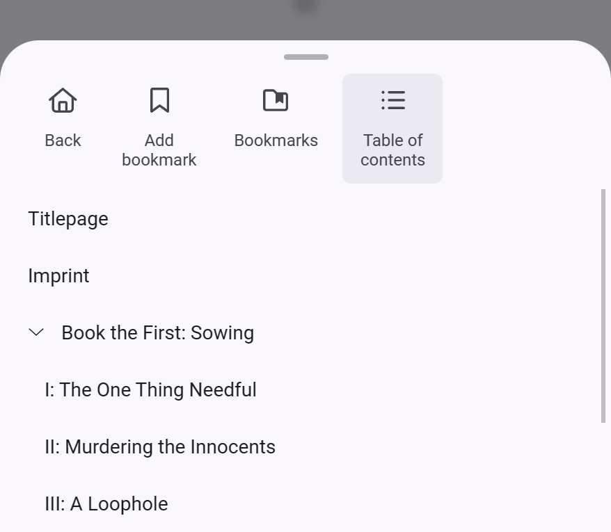
The reader was updated with a modern layout. On mobile, we implemented an entirely new bottom navigation, which you can drag up to see available actions, like displaying the table of contents or your bookmarks.
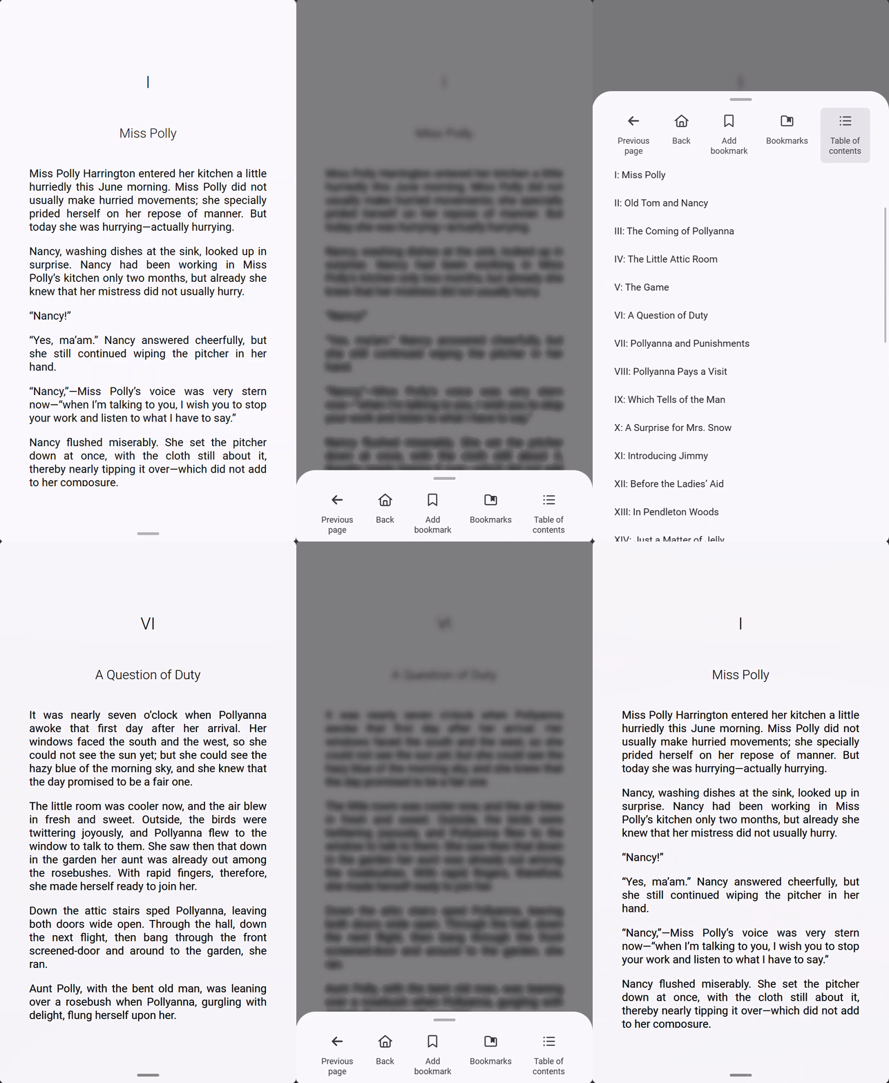
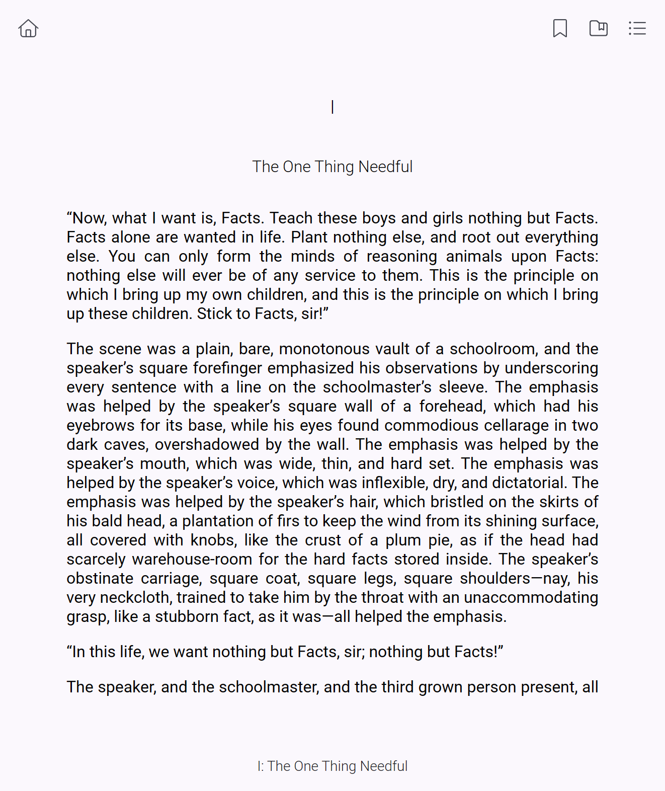
The new book reader interface
For larger screens, we updated the icons and added a new sidebar for the table of contents and bookmarks.
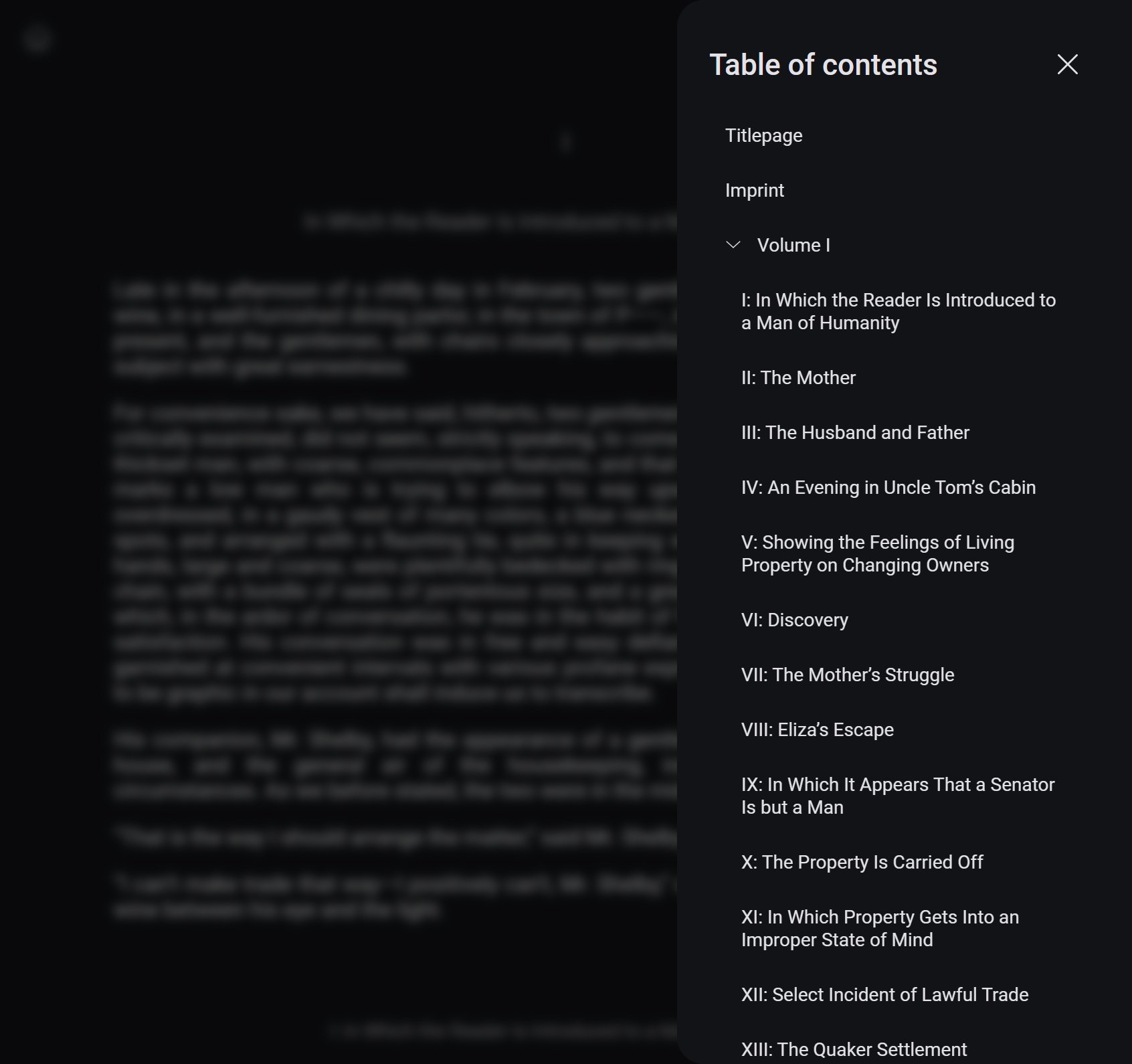
Store
We moved some elements around in the PocketLib Store and removed the sidebar with the list of categories.
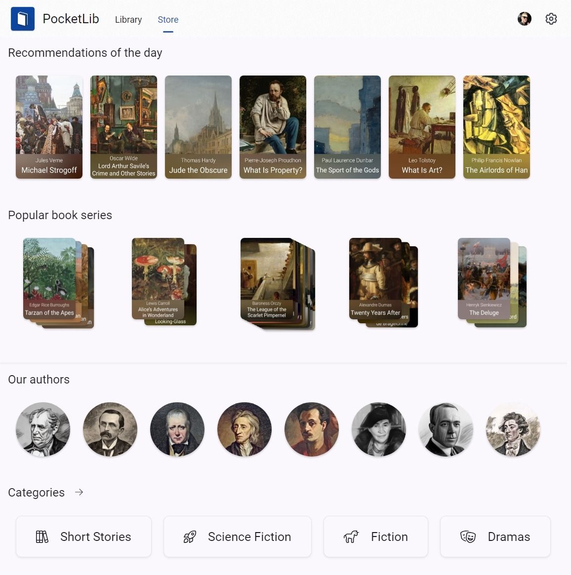
Here you will see different books and authors on each new day, so make sure to check it out regularly!
The book page was modernized as well:
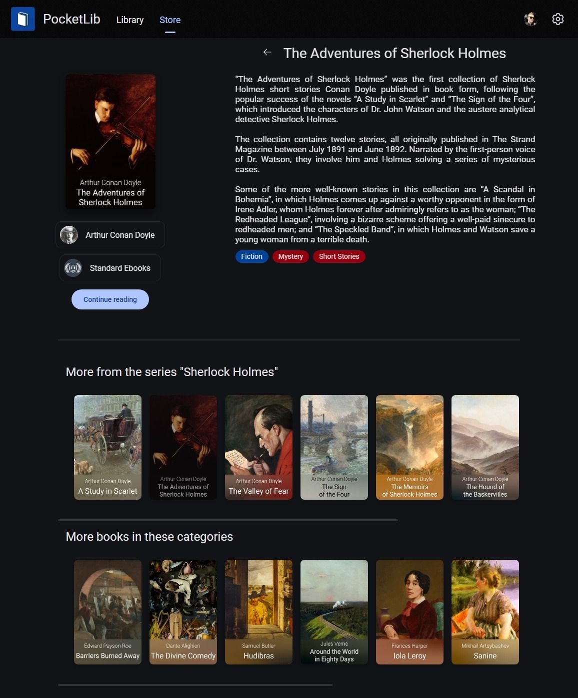
The pages for publishers and authors now feature new lists for the books and authors and a visual refresh for the pagination.
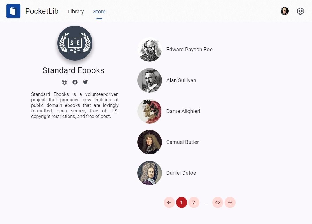
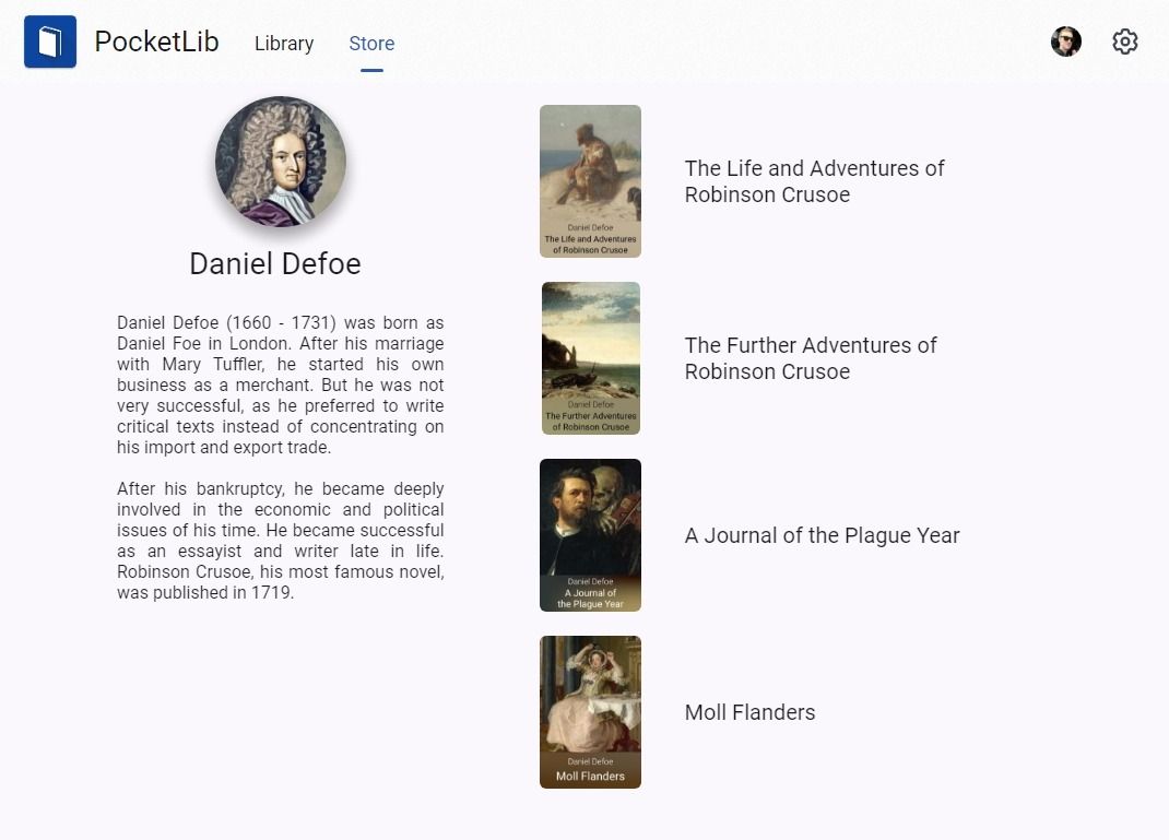
The modern pages for publishers and authors
Finally, we added a new page for discovering all available categories.
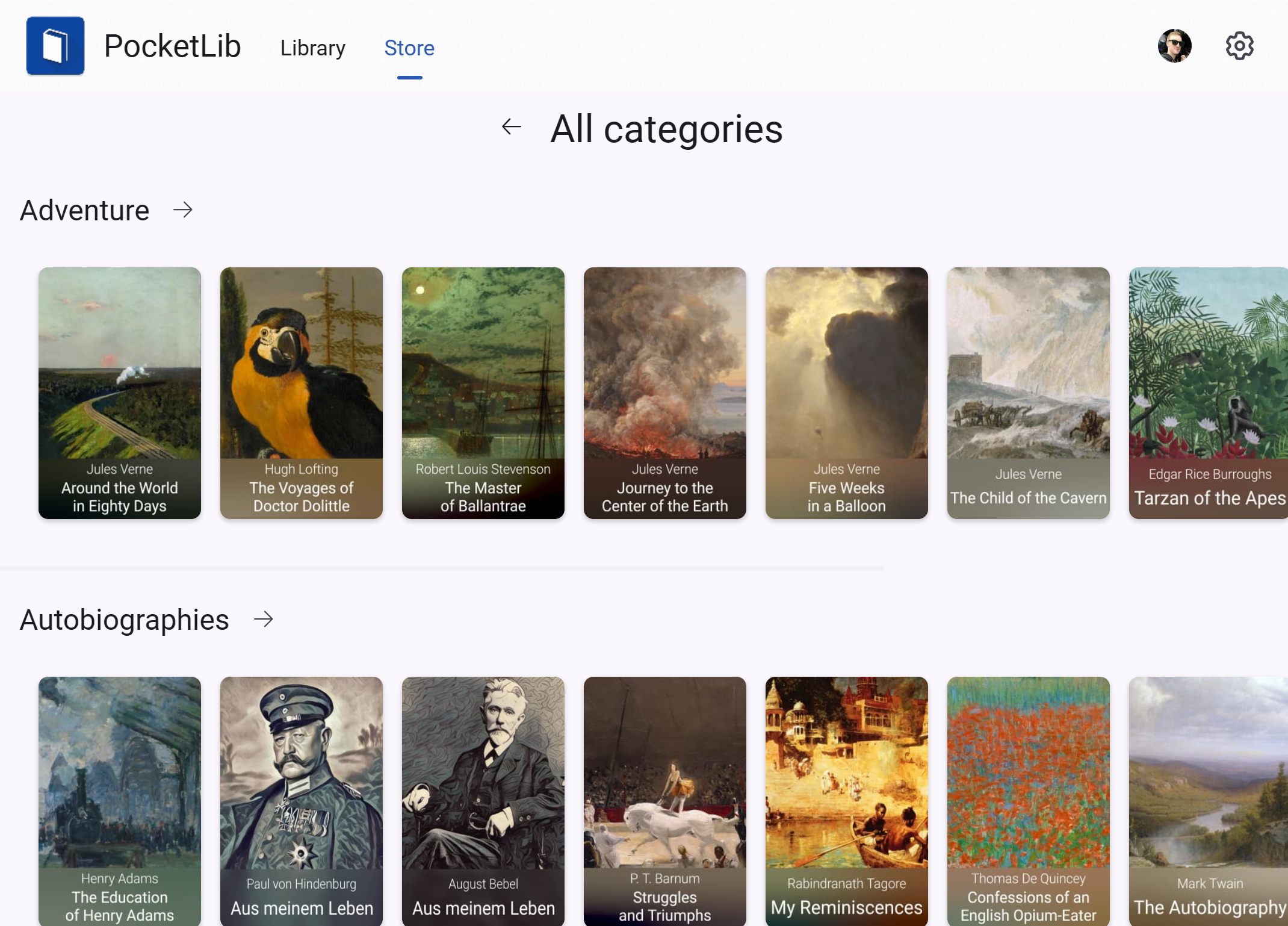
PocketLib v1.6 is now available on pocketlib.app. This was a lot of work, so I hope you like it! As always, feel free to send us your feedback.
David ✌️
»All the secrets of the world are contained in books. Read at your own risk.«
— Lemony Snicket

