UniversalSoundboard Version 2.0: Nested categories, sounds list & much more
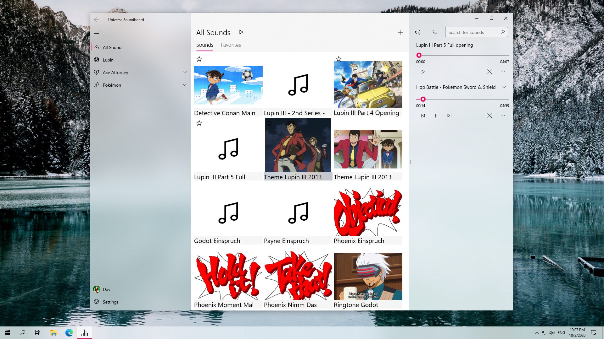
The biggest update for UniversalSoundboard is now available, with a refreshed design and lots of new features and enhancements, including nested categories, a new mode for showing sounds as a list and a bunch of general improvements.
Design
The basic layout and core functionality didn't change, but the entire UI was modernized, featuring smaller buttons with rounded corners, more Fluent Design elements and new animations.
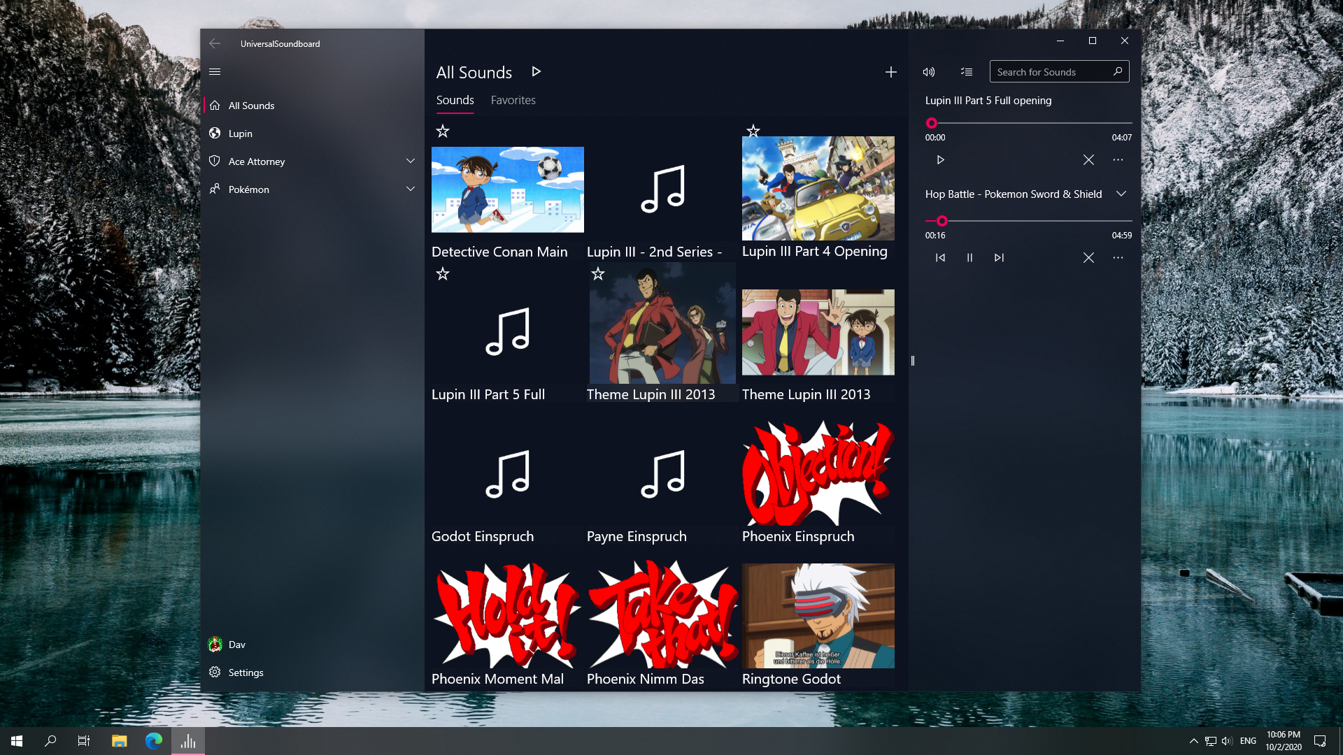
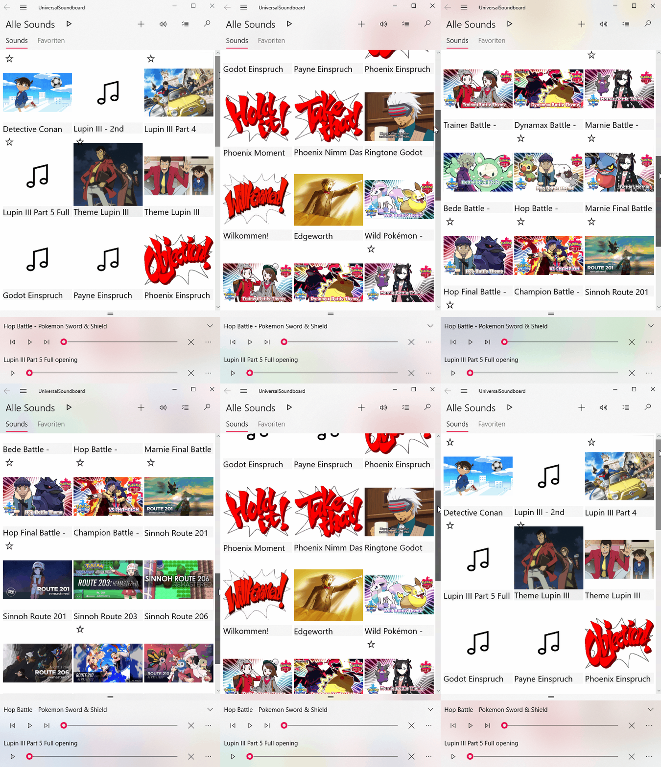
Here is a quick comparison with the old version:
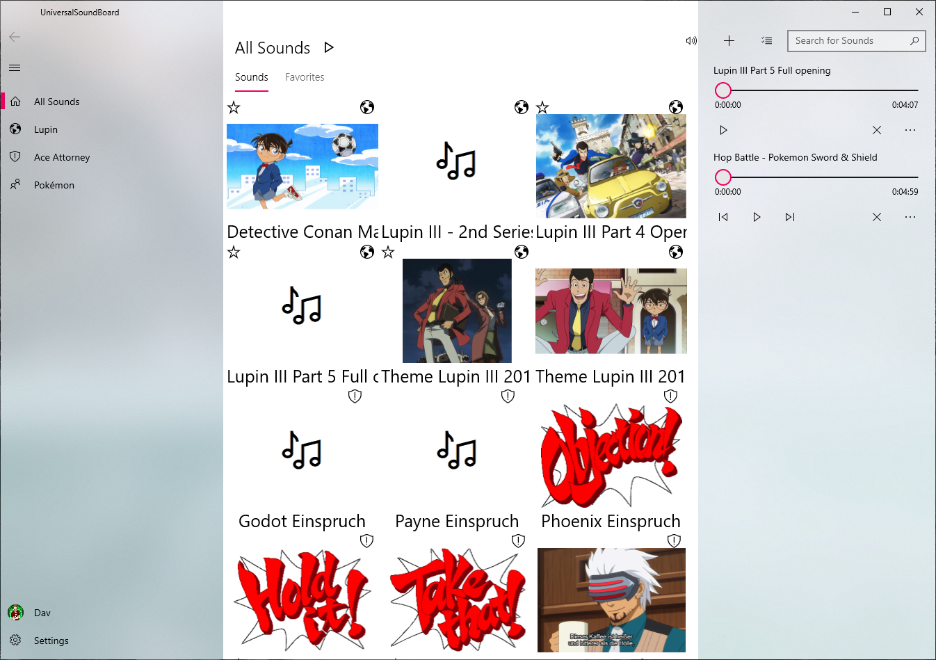
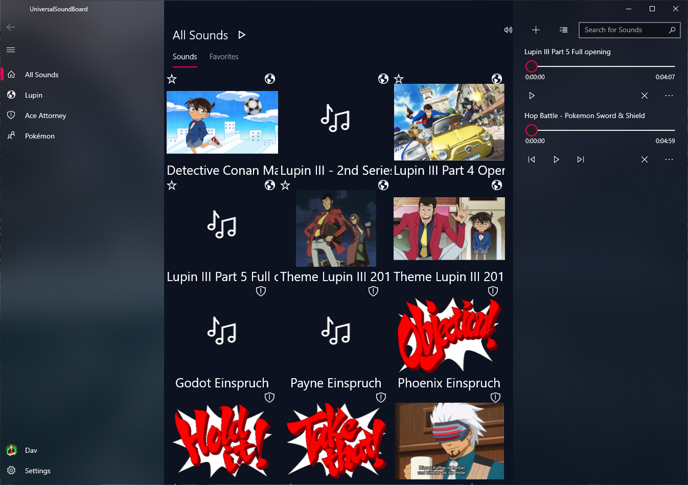
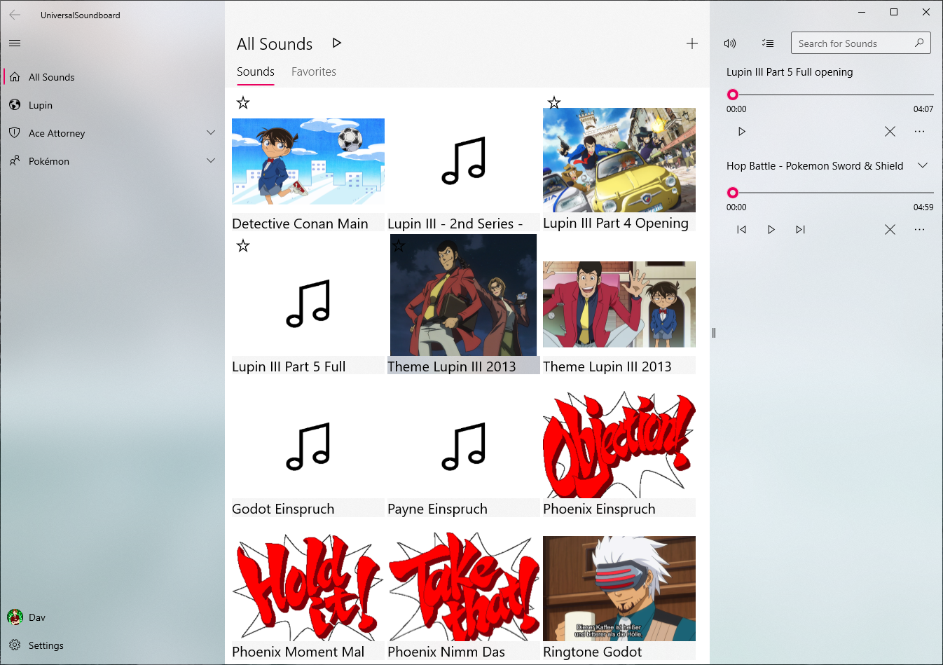
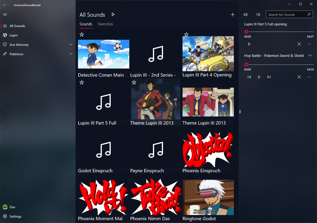
The differences are barely visible, but you will notice the UI improvements when using the new version.
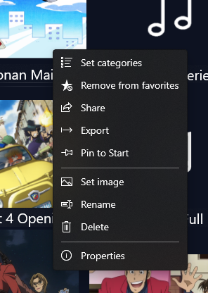
The important improvements are in the details: The buttons are smaller, the context menus got icons, and sounds show the entire name when hovering over them.
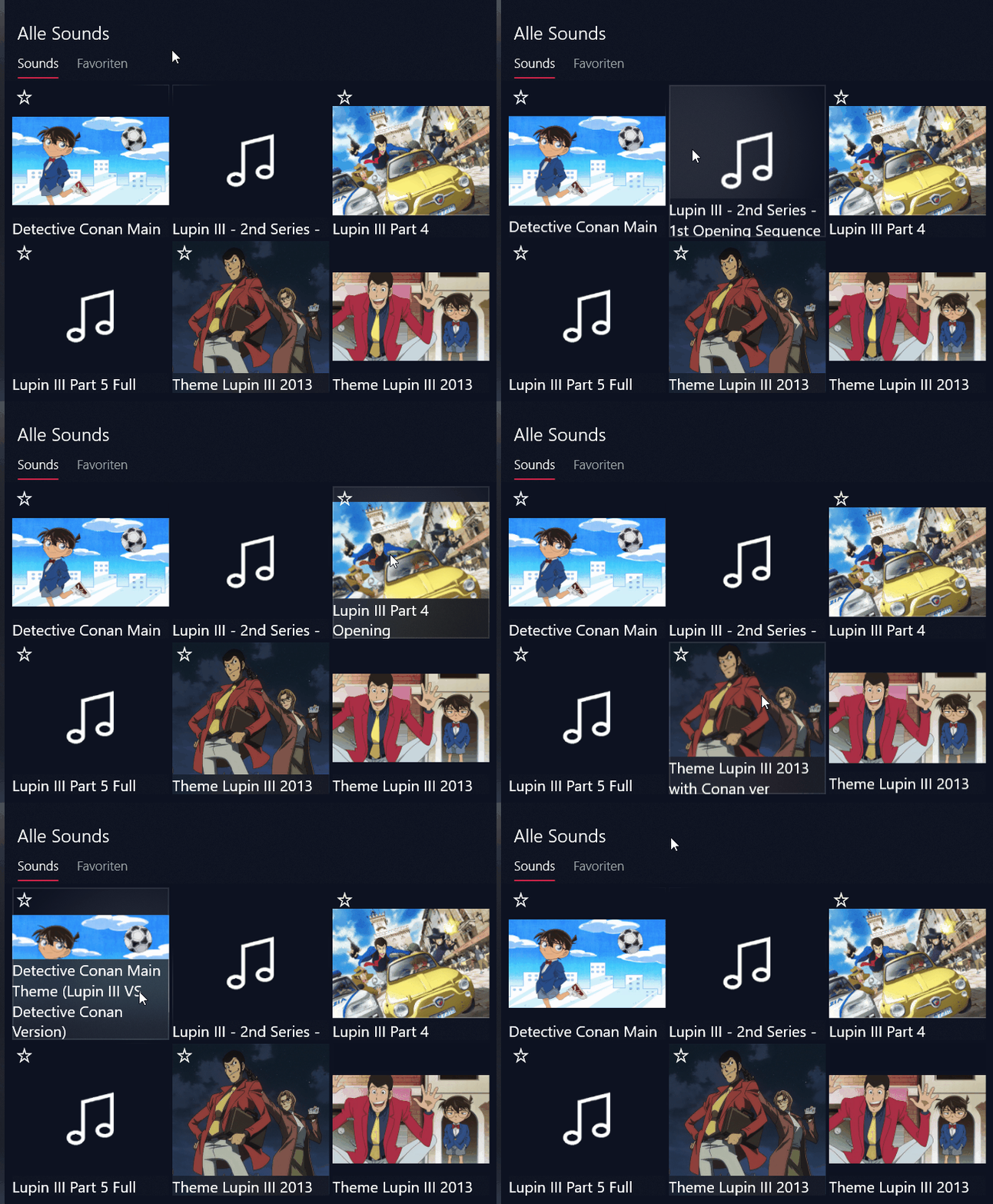
Additionally, the top and bottom foreground elements got some acrylic treatment, which means you can see the sounds through the top header and the bottom opened sounds list.
Sounds list
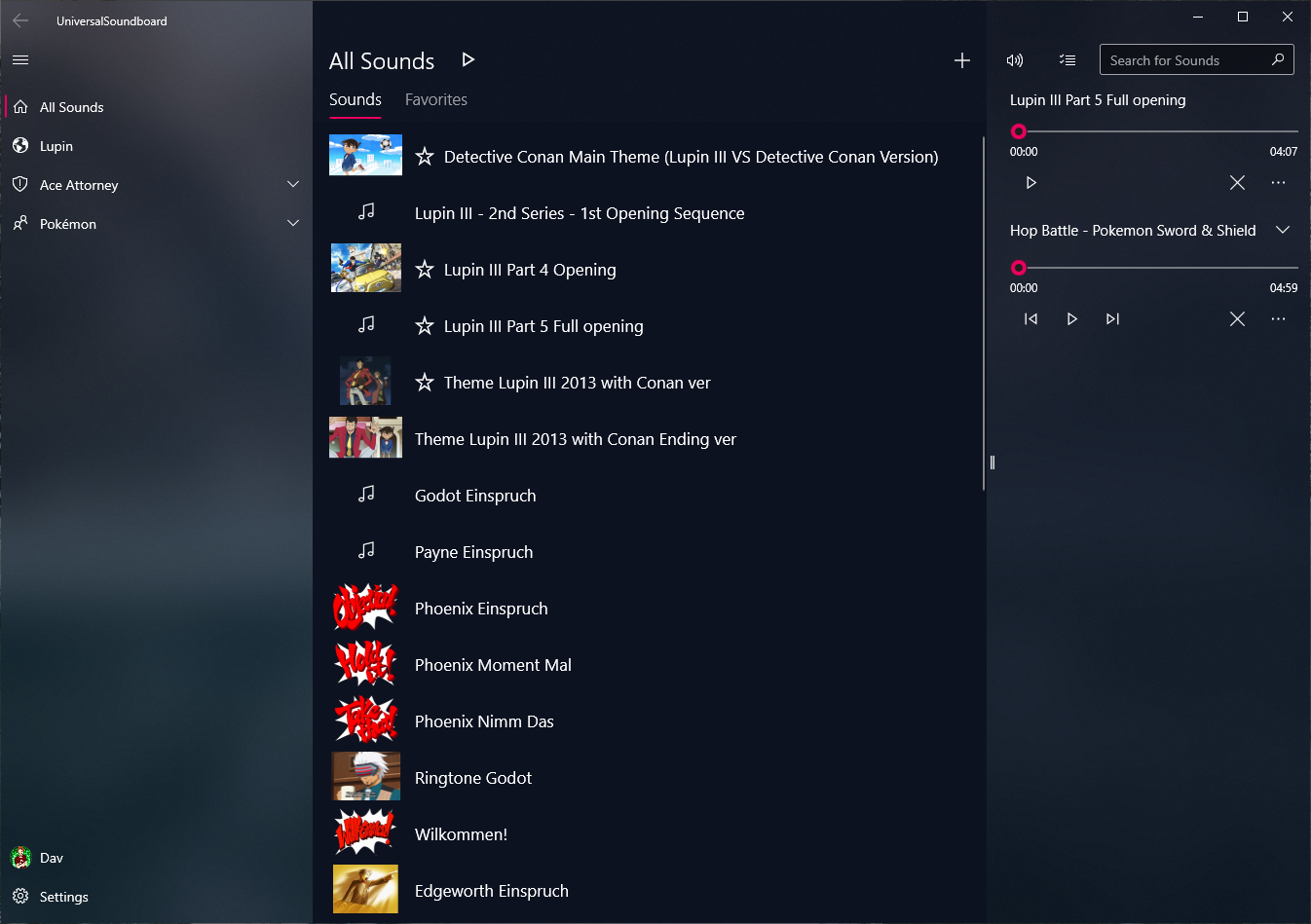
You can now display your sounds as a list, which shows the sounds with a small image and more space for the name. Just toggle the corresponding option in the settings to get this:
Message screens
If you open the app for the first time, a new start message with quick actions will greet you:
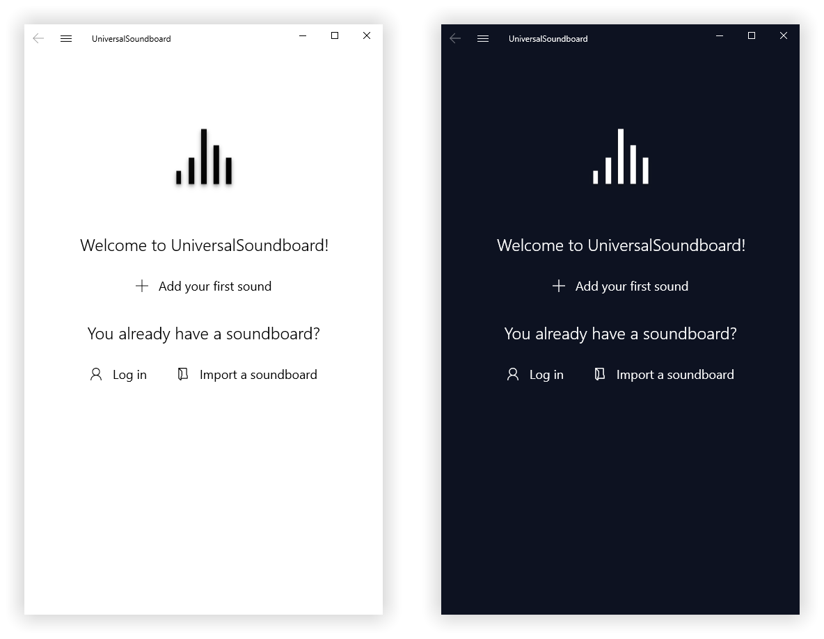
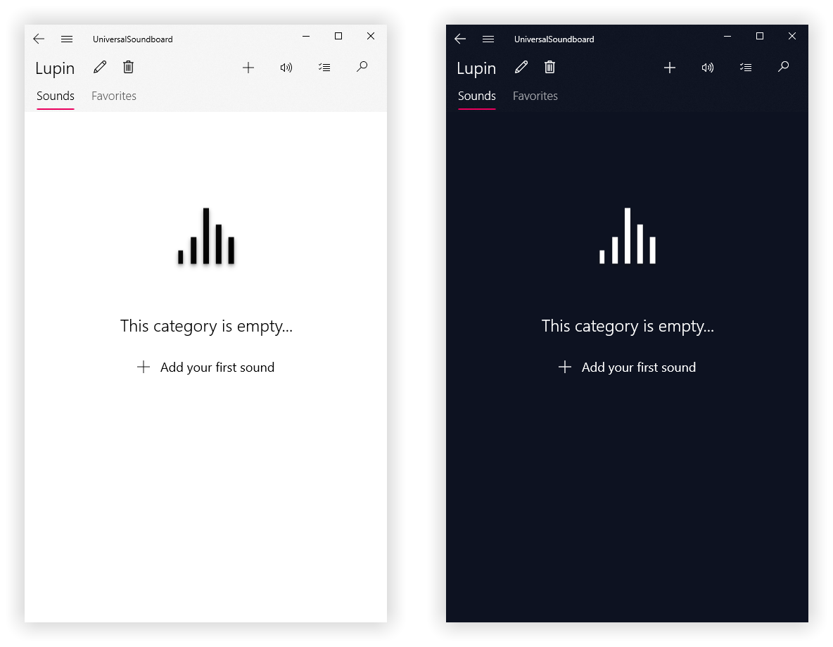
You will see a similar screen when creating a new category:
Nested categories
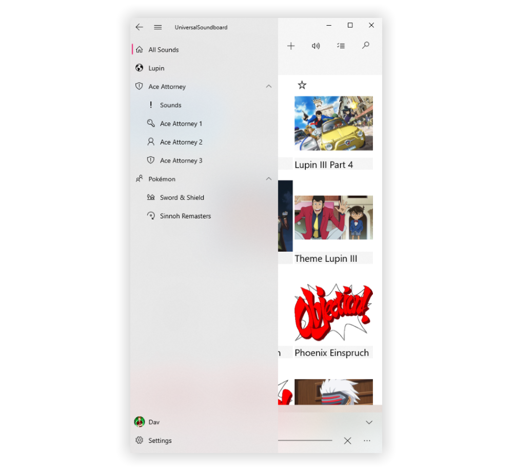
You can now add subcategories to a category, so categories can be nested infinitely. Parent categories will show the sounds of the entire subtree.
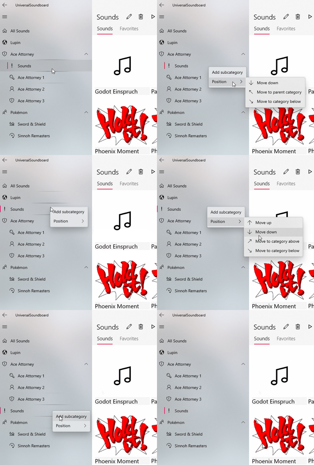
Just right-click on a category to create a subcategory or to change the order of your categories. You can move your categories freely up or down in the hierarchy.
Opened sounds list
It's now possible to resize the right panel with the opened sounds. You can expand it to use up to half the width of the content or make it very narrow.
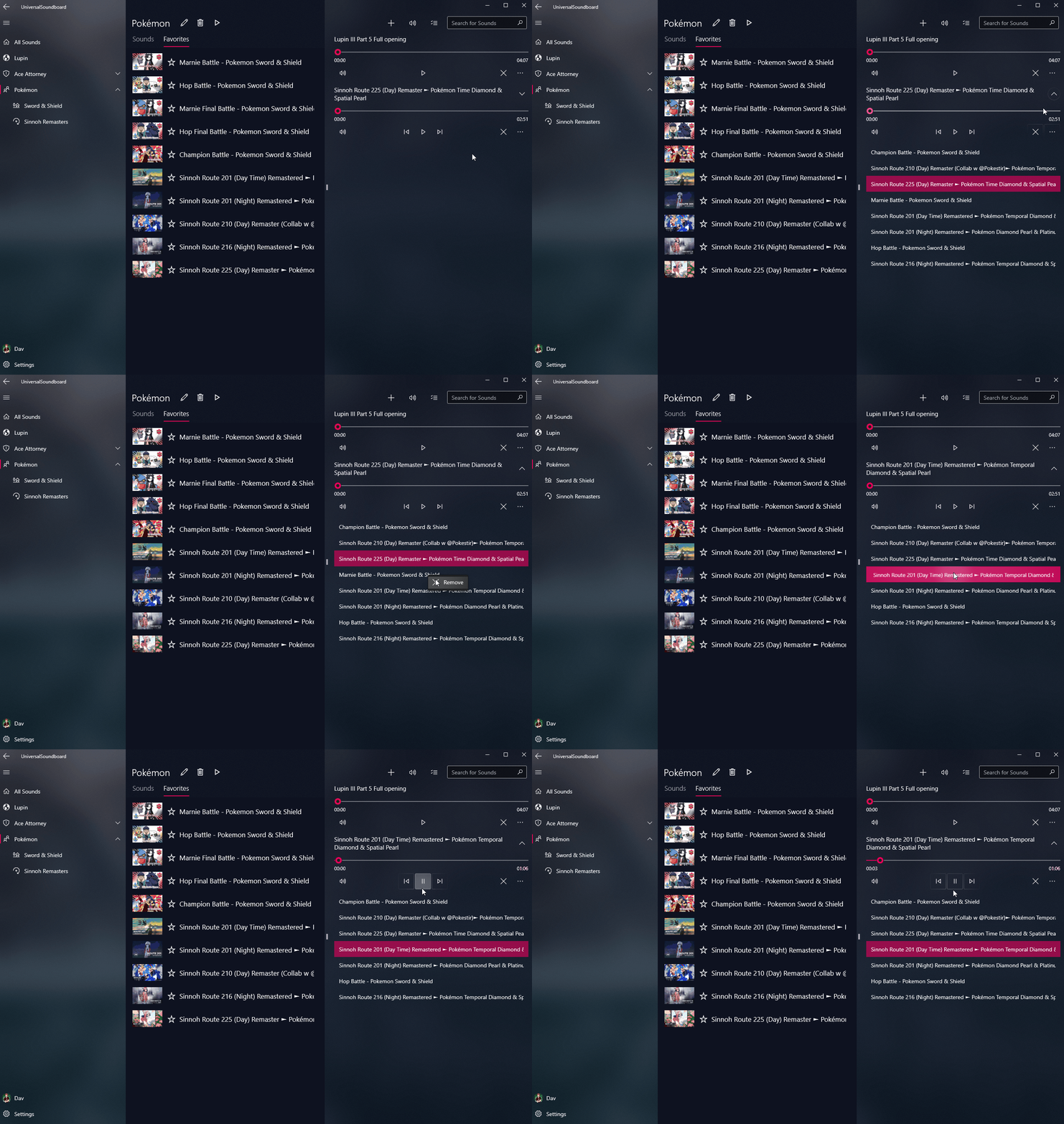
If you are playing a list of sounds, you can now see the sounds by clicking the expand button on the right. In addition to that, it's possible to remove sounds from the list and to select the current sound.
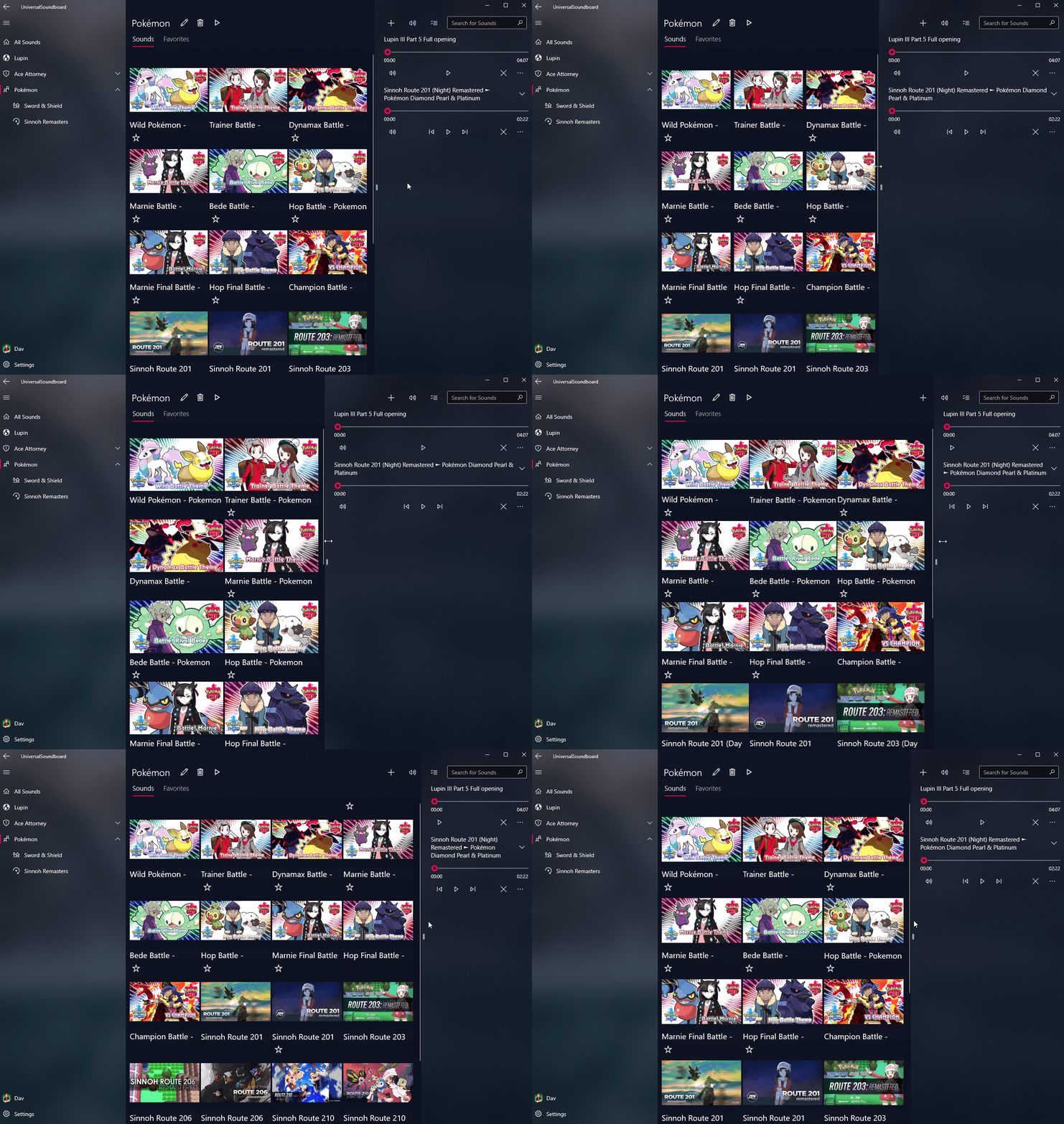
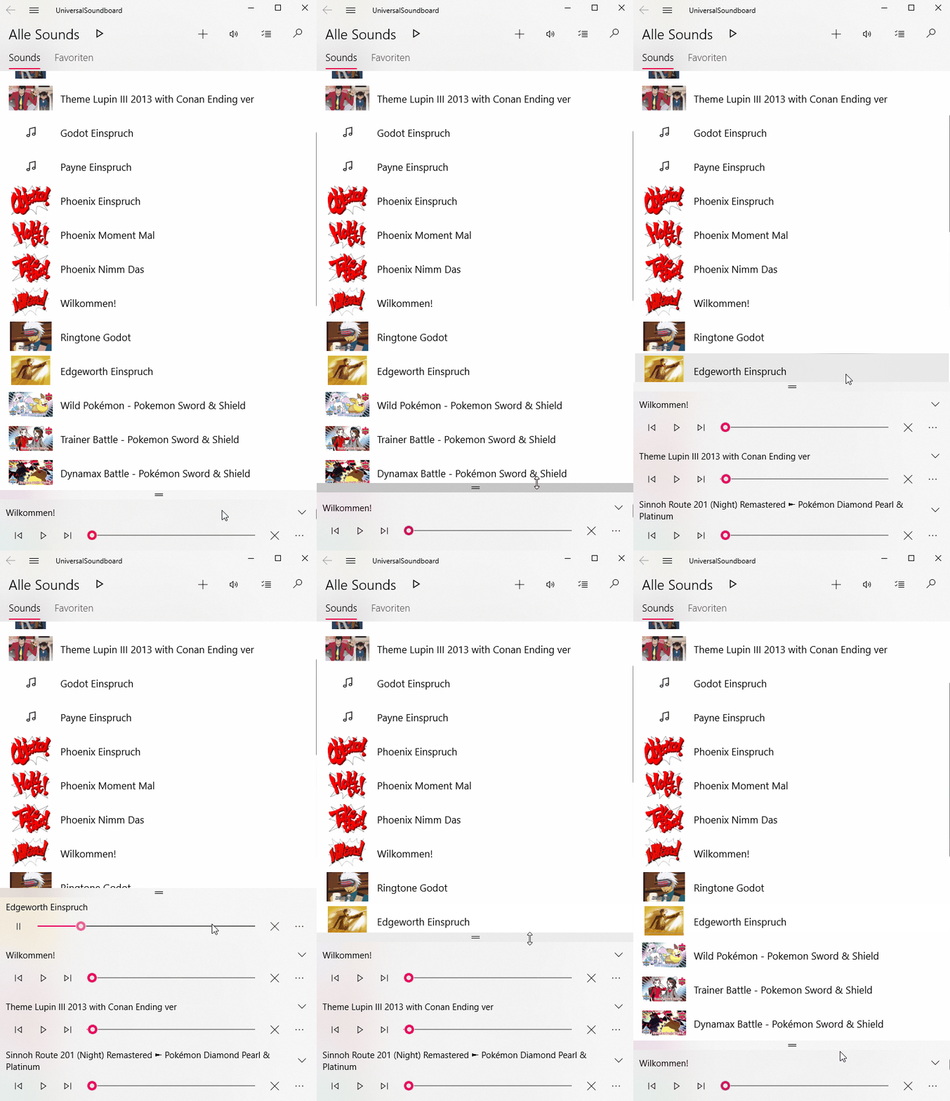
The bottom list for opened sounds, which is visible when the window is very small, now features proper snapping animations. The list is collapsed by default, showing the last opened sound. Drag it up to see the entire list.
Single sound mode
You can now enable a new option to show only one sound. This changes the behavior of the app to replace the opened sound when playing a new one.
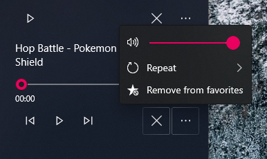
The opened sound always sticks to the bottom, with a larger surface for bigger buttons and a wide progress bar, and your sounds list gets more space to spread out horizontally, removing the right panel entirely.
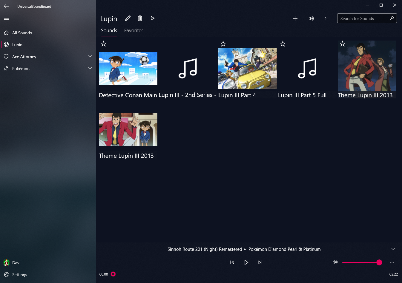
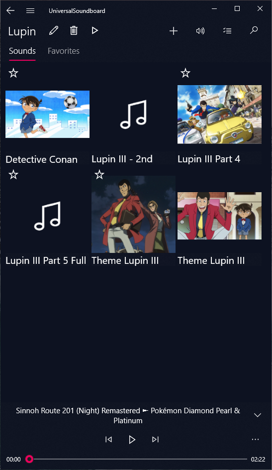
You can unlock this mode by disabling multiple opened sounds in the settings.
Other changes
Account page
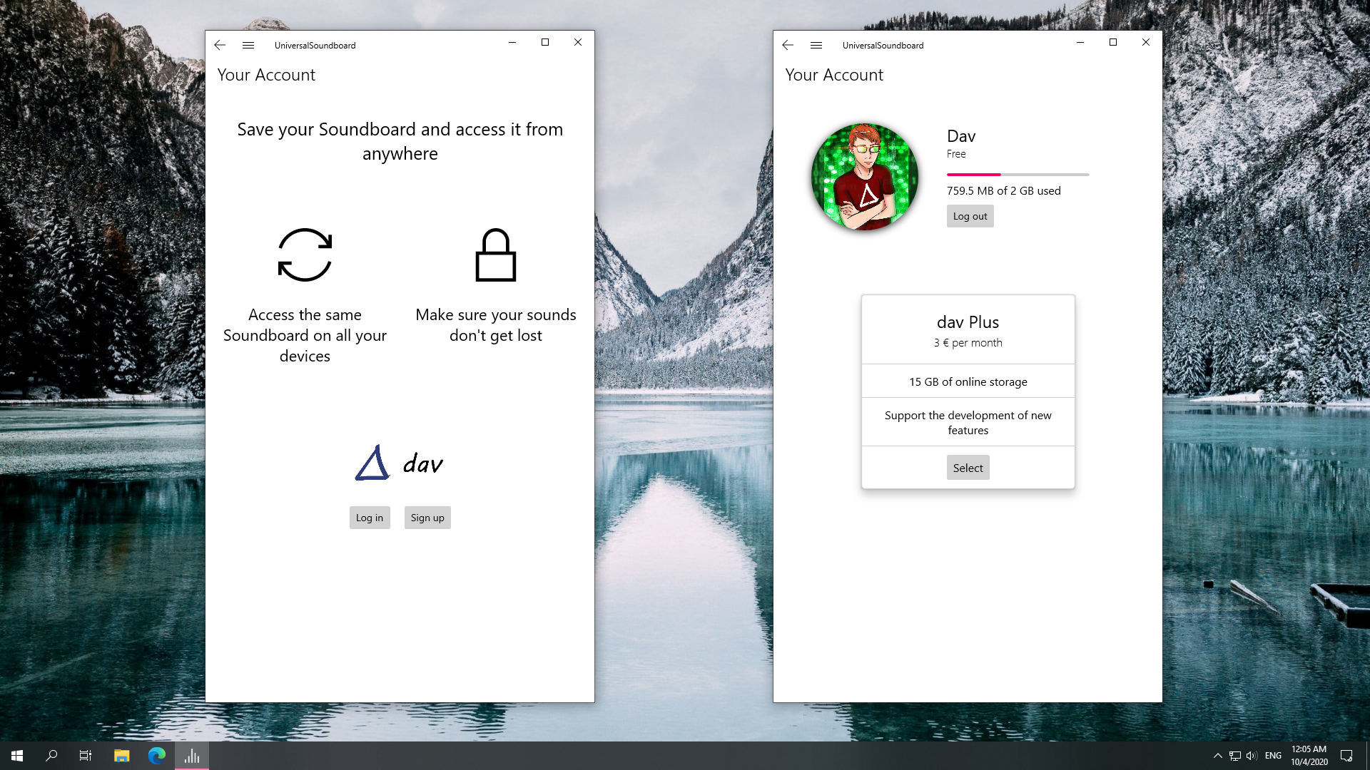
The design of the Account page was simplified and modernized. If you are logged in, you now see the option to upgrade to dav Plus, which was rather hidden before.
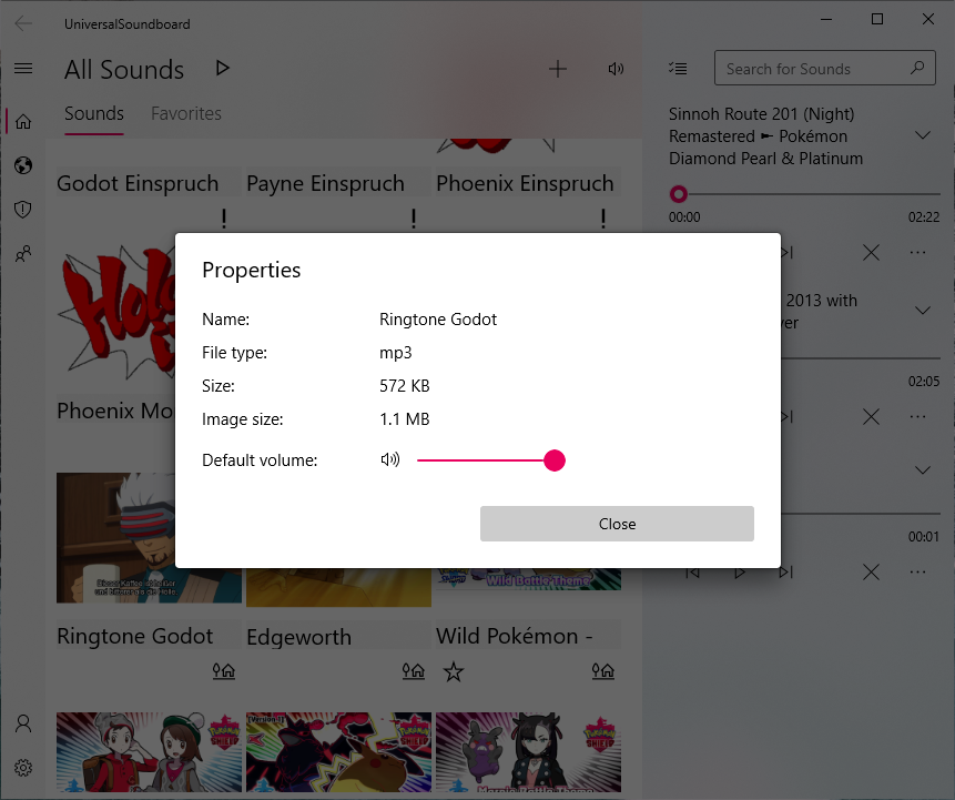
Properties dialog
There is a new properties dialog for sounds, which shows all relevant information about the sound, like file extensions and file sizes. There is also a slider for setting the default volume. When you start a single sound, the sound will play with this volume.
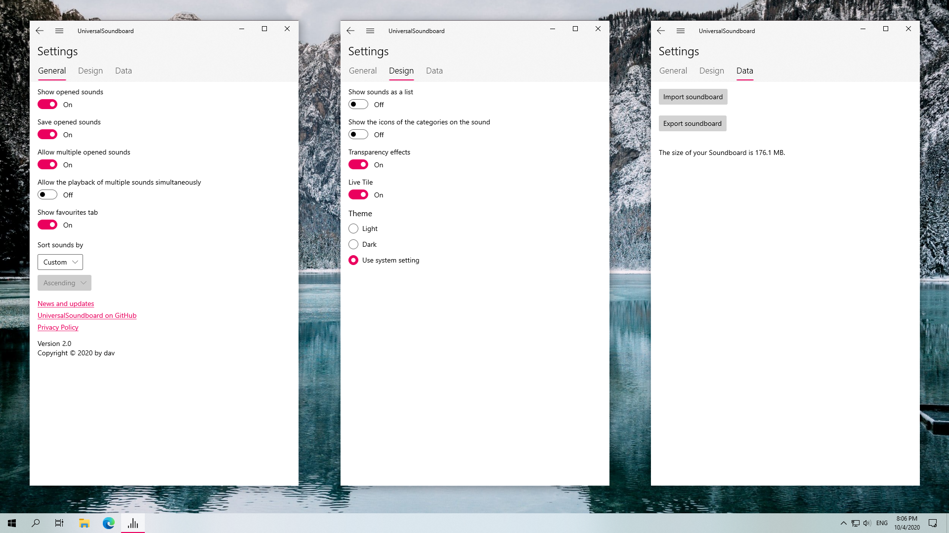
Settings page
The arrangement and the descriptions of the options in the Settings were improved. There is also a new option to play multiple sounds simultaneously, which is disabled by default. If enabled, all other sounds will stop playing if you open a new sound.
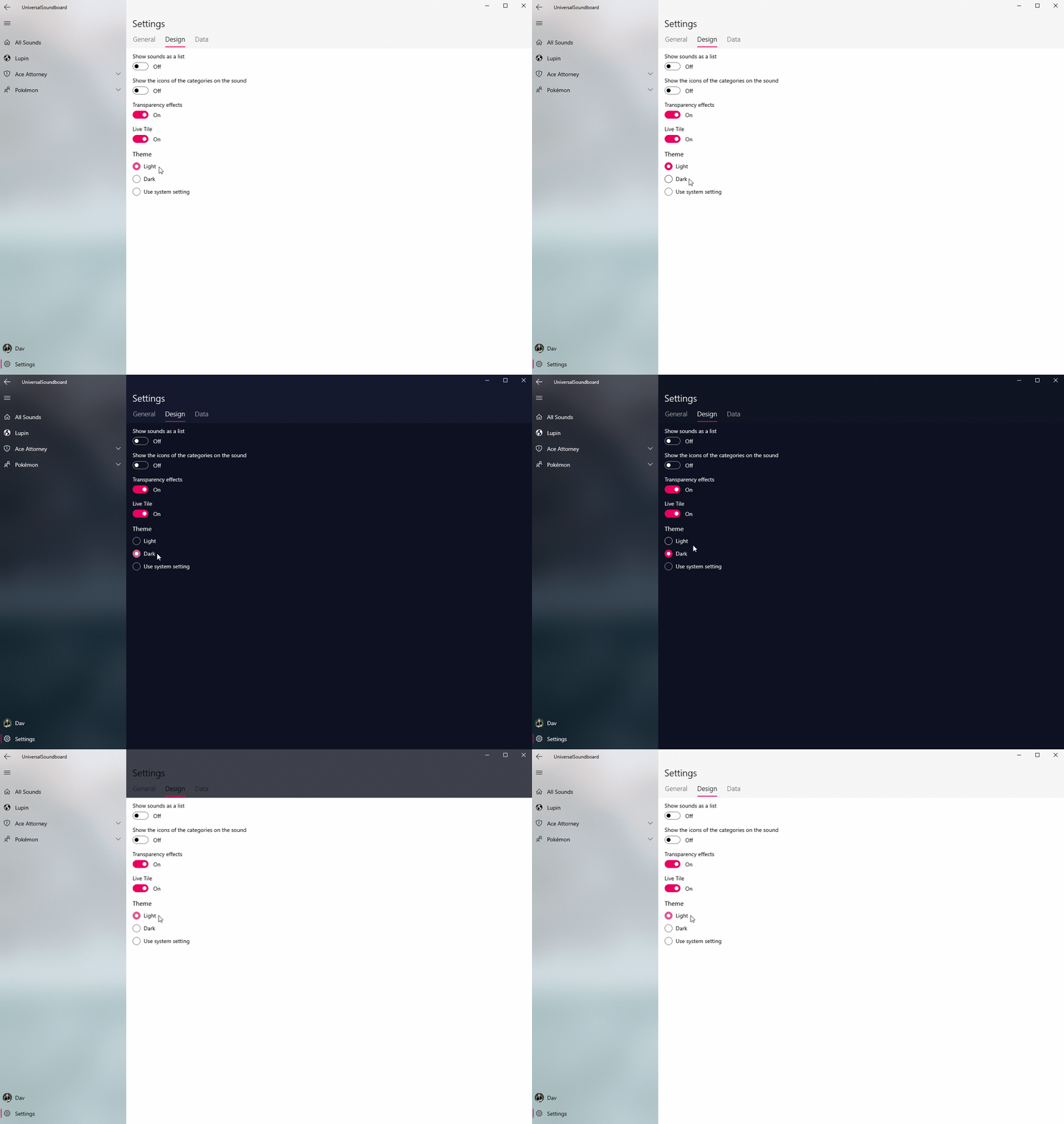
When changing the app theme, the colors are now updated immediately, without the need to restart the app.
This update will roll out slowly, but you can get it now by searching manually for updates in the Microsoft Store.
I hope you enjoy this update. If you encounter any bugs, please let me know so I can catch them all!
David


